Shortcut your way around campus
SlugPath
The Problem
The UCSC campus is located in the middle of lush Redwood forests and is known to be protected territory for animals and humans to coexist. Because of this topography, students often will “hike” to class.
There are many unpaved and unmarked paths and trails (called "desire paths" on campus that students do not know about, and they often lead you to your destination much quicker. Many students do not know about these unmarked paths as they do not show up on popular mapping applications like Google Maps.
Research
Prior to our research, we weren't sure how much interest there was in the problem or what kinds of students would be interested in using our app. We wanted to find out more about how students are commuting to and around campus and if they would be interested in taking desire paths instead of their normal routes. Some of the questions we found most helpful in interviewing are shared below.
Key Questions
How do you get around campus?
Helps understand how user commutes around campus and if they would be a good candidate to use our application.
Do you use any desire paths on campus? If so, do you use them regularly?
Helps us understand if the user is familiar and gauges comfort level of taking non-traditional routes.
Do you use the busses to get around campus?
Helps us understand the interest of users who take the bus on campus.
How much time do you spend commuting around campus? Are you satisfied with it?
Helps us understand how much time user is spending to get around campus and if they have any frustrations about commute time.
Would you like to learn more about different desire paths?
Helps gauge if user is interested in taking desire path routes.
Do you know of any desire paths on campus?
Helps us understand how much time user is spending to get around campus and if they have any frustrations about commute time.
If you knew of desire paths that would get you to your destination sooner, would you use it?
Helps understand whether the user would be comfortable with taking desire paths if they offered a faster commute time.
Insights
We found that most students walk to their destination on campus. Many knew that there were other unmarked/desire paths to get to different areas around campus, but rarely used them as they did not know where they would lead, and going on a paved path was a safer and more trusted way to get to their destination. Many of the students who know about desire paths and are interested in using them also ride the bus on campus.
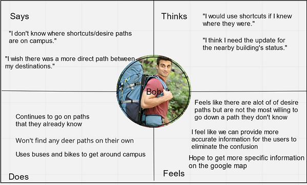
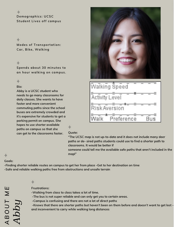
With the information gathered from our user interviews, we developed the following user empathy map and user persona.
Empathy Map
User Persona
Proposed Solution
After gathering user insights, we decided that some key aspects of our solution should be the following components.
A Navigation App
Something similar to Google Maps, where people already know how to use to guide users to their destination
Ability to Explore New Paths
List some popular desire paths to allow new desire path users to see the path options around them
Community
Foster a community where users can share new Desire Paths that they find and discuss their experience
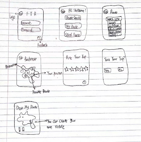
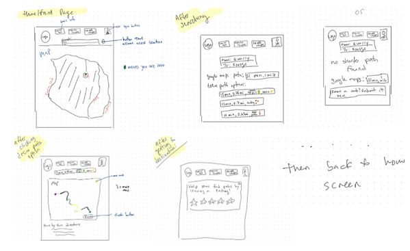
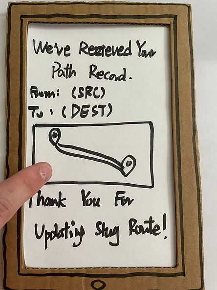
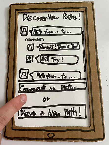
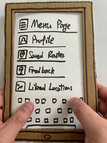
Design
We thought about how we would want our application to look and came up with the following sketches.
Sketches

We also thought about how we would want our application to be structured so that using our application would be intuitive. We came up with the following Site Map and User Flow.
Site Map
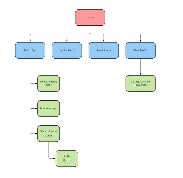
User Flow

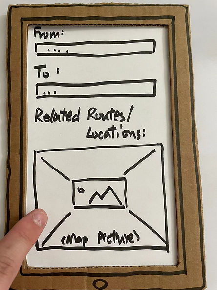
When starting to prototype, we quickly realized that we needed to make modifications to our design, as we included things in our Site Map and User Flow that we no longer felt was useful for the app (ie, the "Setting/Location Permission" on the Site Map). We then created this lo-fi prototype with changes that we saw fit.
Lo-Fi Prototype


Design Color Palette

60% Denim
30% Hot Cinnamon
10% Lima

Hello Slug.
Usability
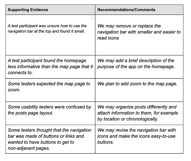
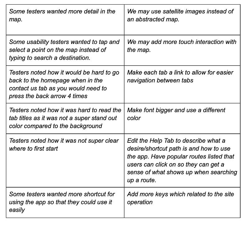
Usability testers were confused about whether the navigation bar was clickable and linked to other pages, and some testers reported that they had trouble reading it. Some users expected the map to have a zoom function and felt it would make it more useful. Usability testers who were less familiar with desire paths or deer paths were sometimes confused by the term “Slug Path” among the other terms. We learned that users wanted more navigation options in the app with more buttons linking the pages together. Some testers requested more detail in the map to find stairways, trails, and different floors more easily. Users who weren’t familiar with deer paths or the shortcuts on campus needed more explanation of the purpose and utility of our application.
How Usability Testing Helped for Improvement
Usability testing was crucial for our design process. Since we were the designers of the application and already know how it should potentially work, we failed to see many issues that arose in the general usability of our application during our first iterations of our hi-fi prototypes. Usability testing also provided us with suggestions that we would not have been able to come up with ourselves and offered us a good real-world sense of what possible user experience frustrations would be, and how we can eliminate them. We used many of the suggestions for our final prototype.
Hi-Fi Prototype
After making edits to our Figma prototype after usability testing, we came up with the following Hi-Fi prototype design. We improved our hi-fi design with feedback from instructors and made our design more interactive.
Below is the Figma presentation of our Hi-Fi prototype. To view prototype in Figma, please click on the 'SlugPath Final UI Group 17' Titile.
Design Overview


Feedback
We have several findings based on our test result:
Homepage
-
Students are interested in our homepage
-
The homepage design is aesthetically comfortable and most of the students love our design
-
Participants were unsure if the navigation bar at the top of the page was an indicator or a row of buttons, and thought it was small either way.
-
Participants thought that the homepage didn’t explain the use and utility of the app as well as the map page did.
-
Participants noted how the quote on the homepage did not really add to what the application was meant to do
Navigation, Links and Terminology
-
Our navigation is accurate enough to lead the user to the correct destination
-
The terminology we use is native and readable
-
Participants had the impression that the navigation bar was made of links
-
Participants noted that it is not very convenient to navigate through the application only using the back and forward arrow
-
Participants noted how they were confused on what a “Slug Path” is. They knew that it was the name of the application but unsure if that was the term we were using to describe shortcut paths
Content
-
We provide all necessary information for the destination and the landmark to the user
-
Some usability testers wanted more detail in the maps to identify things like stairways, different floors, and trails.
-
Participants wanted to see popular paths to better understand how the application works
-
Participants noted that the “bubble format” of the Help Page was hard to read and how it would be nice to have a paragraph with steps instead
Searching
-
Our searching engine is accurate, correct, and fast
-
A participant wanted to select a point on the map instead of typing a destination in to search.
Intuitivity
-
Our app is user friendly for most of the people who use computer or phone
-
If unfamiliar or don’t know that there are shortcut paths on campus, it is hard to understand what the application is for upon first glance

Improvement
Improvement